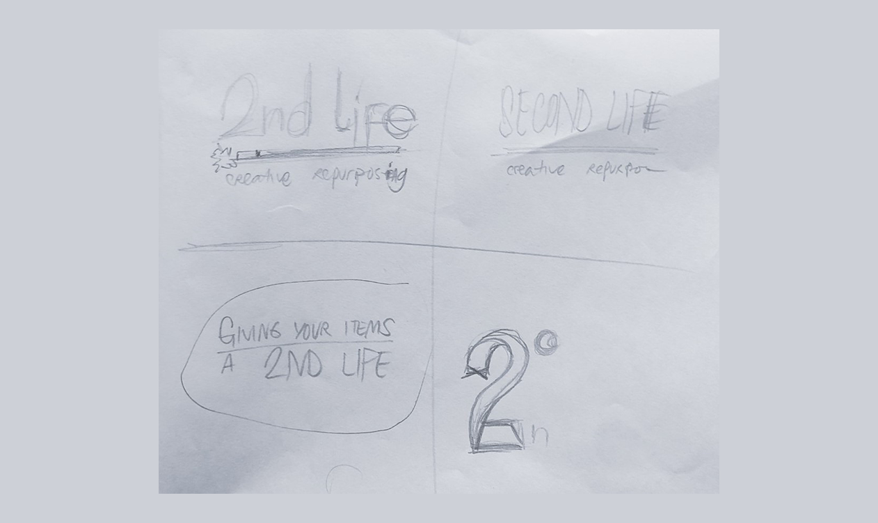
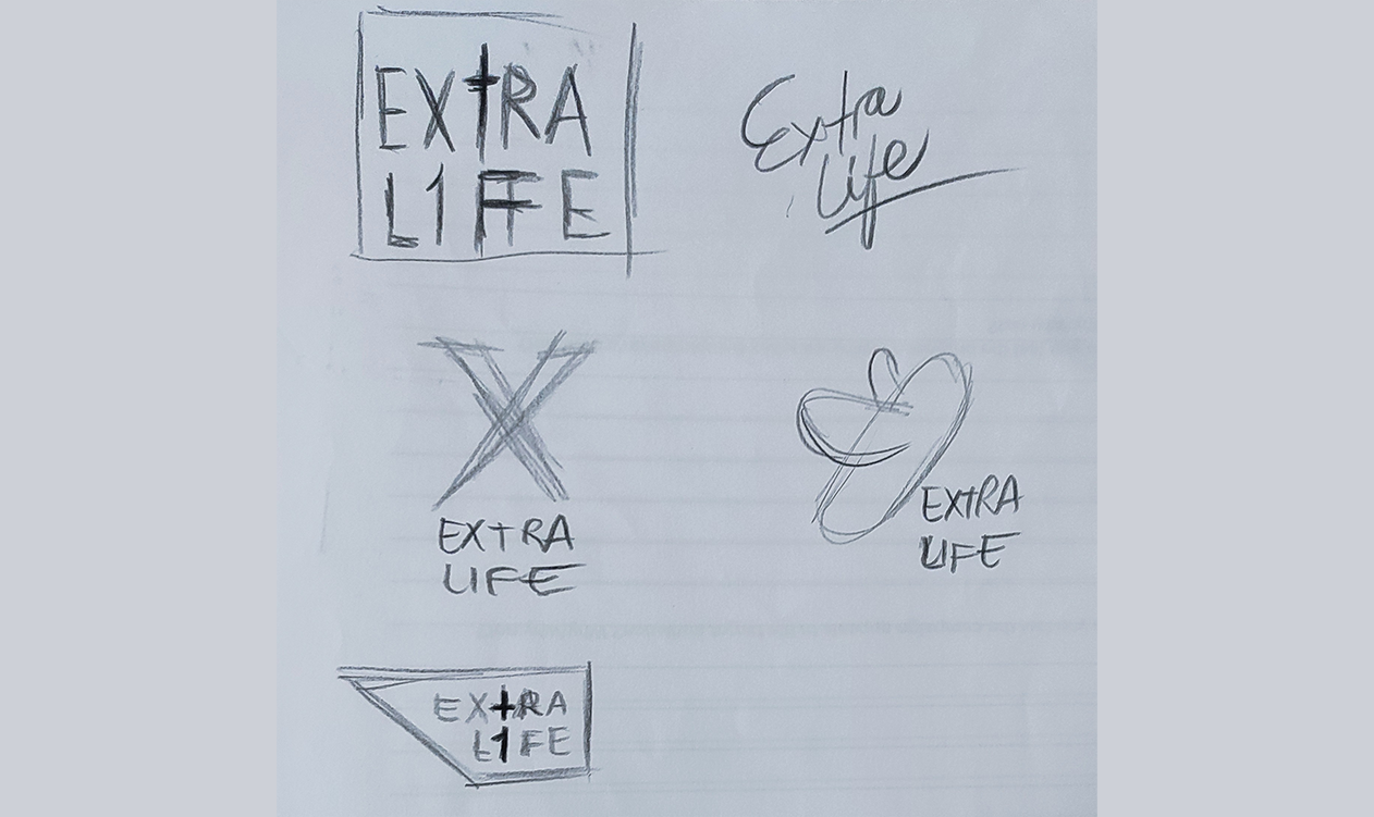
Early Sketches & Ideation
The the initial name for the project was "2nd Life", which had a logo with a "crafty" look and a sky-themed blue color palette. After market research revealed similar ideas (some being virtual reality or tech refurbishment), the name was changed to "Extra Life" to maintain uniqueness while keeping the core idea.
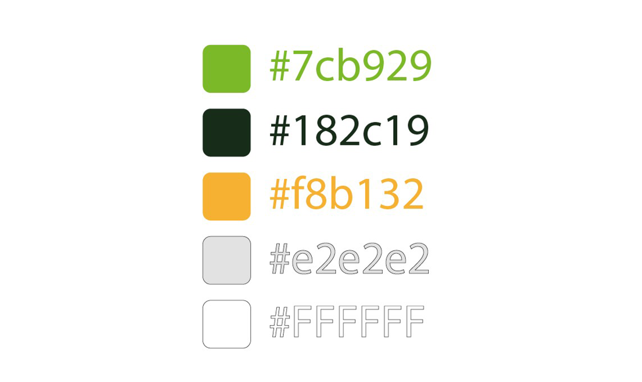
Color Palette & Slogan
The final color palette for the entire campaign is organic and contrasting:
- Greens (Main Colors): #7cb929 (medium green) and #182c19 (dark green), chosen for their organic look suitable for a recycling campaign.
- Light Orange (Accent Color): #f8b132, used to add contrast with the greens.
- White and Light Grey: #FFFFFF and #e2e2e2, used for text and primarily for app backgrounds (often as a gradient)."
The campaign's slogan is: "Add an extra life to your unwanted items."
Logo & Typography
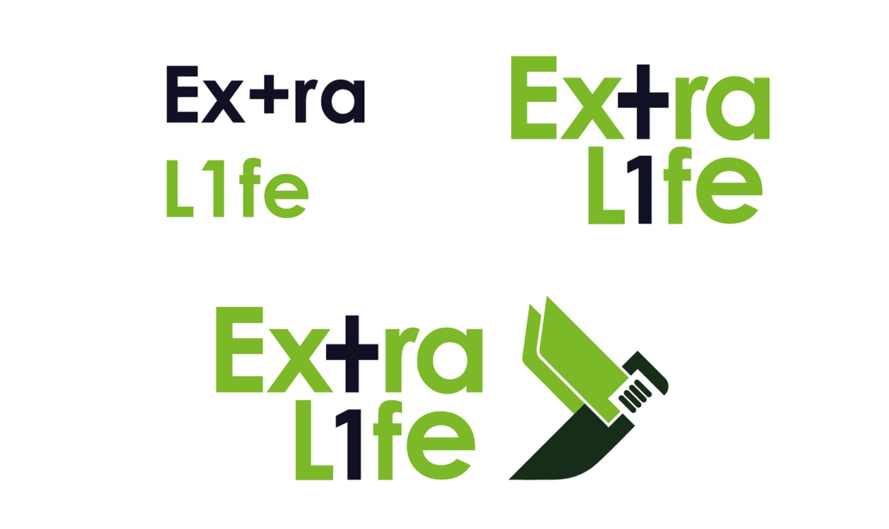
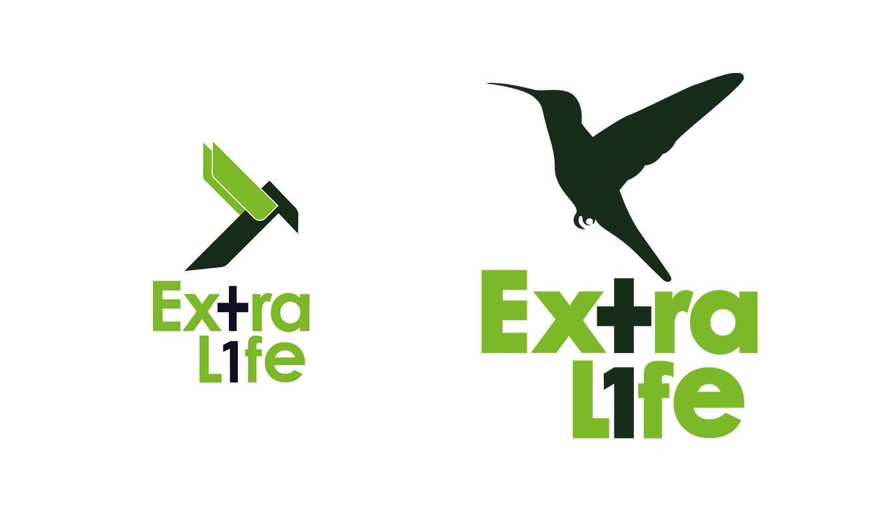
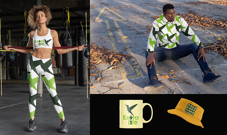
The logo's appearance was adjusted to be more "adult-looking," aligning with the target audience. the logo's incorporates a "+1" symbol, where + acts as a "T" and 1 acts as an "I" in "Ex+ra L1fe." Reinforcing campaing's message. The final imagotype for Extra Life is designed to look serious and appeals to an adult audience. The concept involves an abstract interpretation of a hummingbird, symbolizing spiritual significance, resurrection of souls, strength, love, beauty, harmony, and balance.
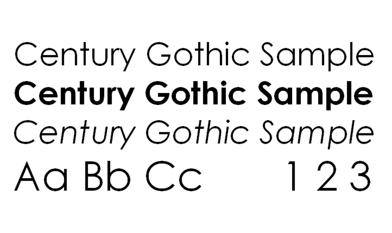
I used “Century Gothic” for all my campaign elements due to it's high legibility and simplicity, in different
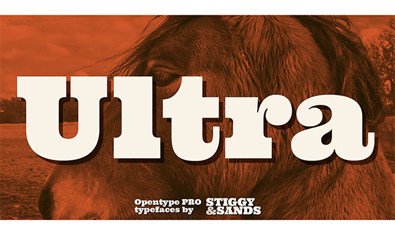
weights, as bold, regular and light. And “Ultra Regular” font for the titles
and subtitles of the posters.
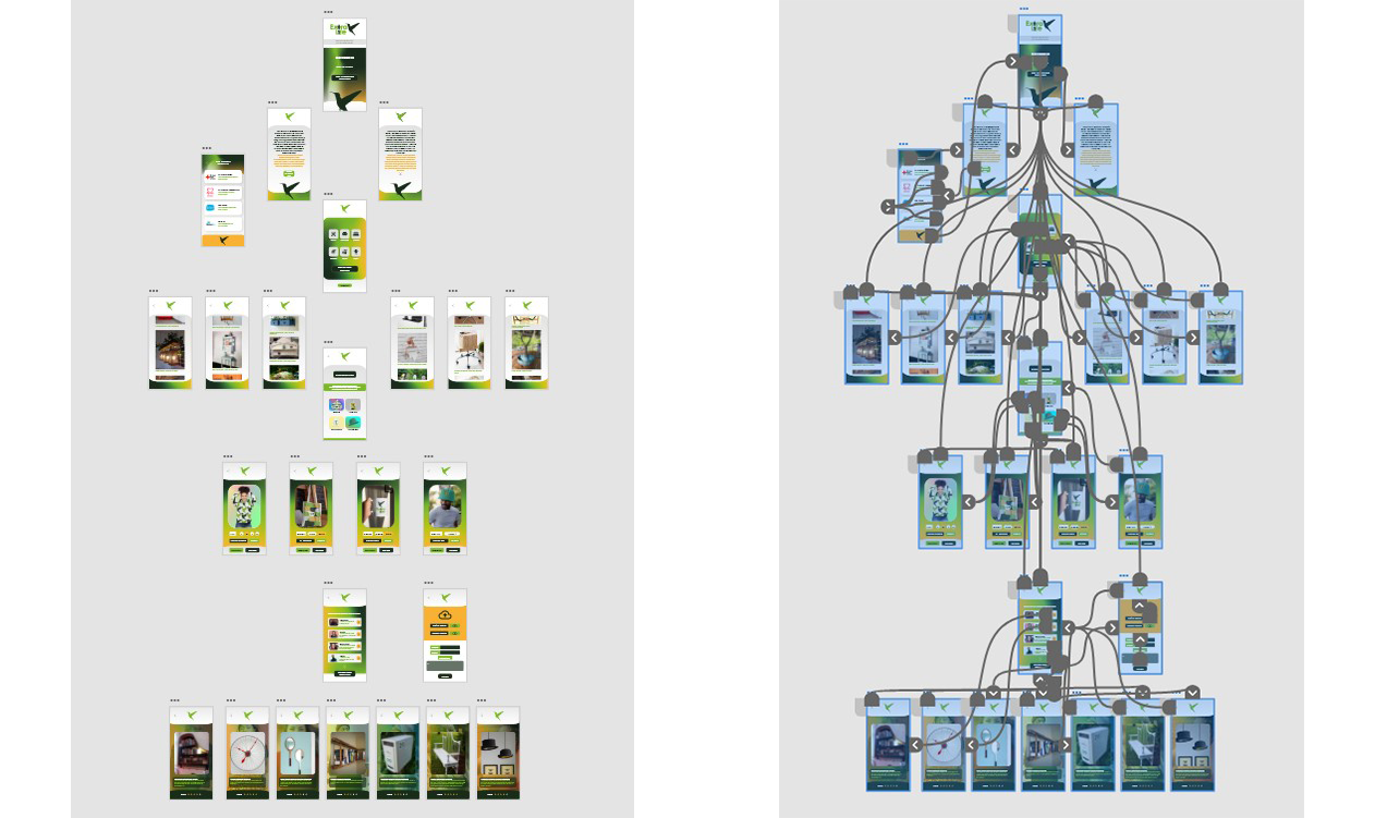
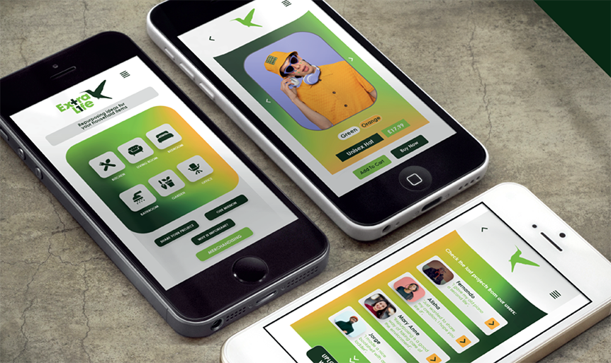
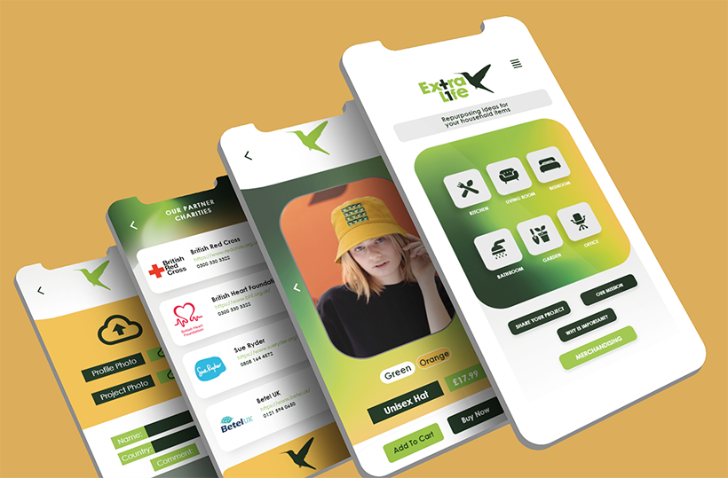
App Mockup Design & User Flow
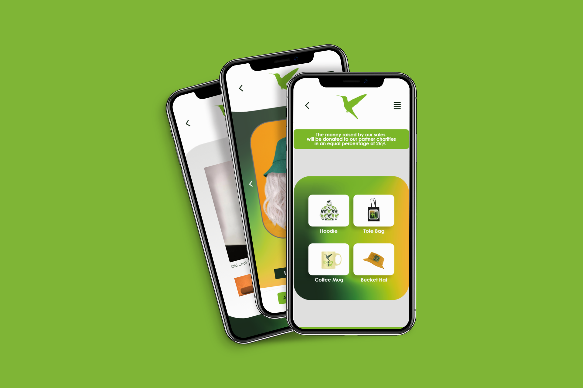
The Extra Life app is designed to be simple and easy to use, especially for elder people in the target audience, with no logins, registrations, or waiting times to get users quickly to the content. The main page is simple, featuring the logo, a brief explanatory text, and three main links: "Categories," "Our Mission," and "Why is Recycling Important?". The app's design language emphasizes consistency across pages, with clear button aesthetics and a user-friendly menu for easy navigation.
- Categories Page: Features 6 categories (kitchen, living room, bedroom, office, garden), each linking to a page showcasing refurbished item ideas (pictures). Users can also "send their projects" to be published in the app's project gallery.
- Our Mission Page: Explains the mission of recycling and repurposing benefits. Includes a "Donate" button linking to a page with partner charities for users unable to repurpose items themselves.
- Project Page: Shows user-shared projects with pictures, names, comments, and a rating system. Users can upload their profile and project pictures, name, country, and comments.
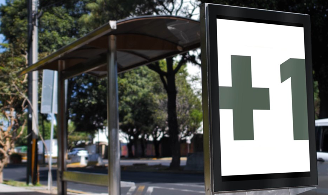
Billboard & Merchandising
The visual billboard advert was designed to be eye-catching and colorful, using flashing lights. The message, "We want you to add +1. An extra life to your unwanted items," aims to encourage repurposing in a fun and vibrant way.
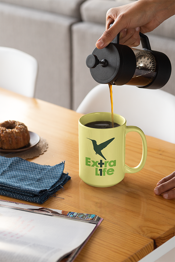
The campaign also includes merchandising items (hoodie, tote bag, coffee mug, bucket hat) designed with the campaign's logo and color palette. These items aim to raise funds for partner charities (25% to each of the four charities). Merchandising items feature size/color options with interactive hover effects and are showcased to demonstrate versatility.
This project aims to encourage a behavioral shift towards creative repurposing of unwanted items, fostering sustainability and community engagement. From a strategic redesign of the logo to the development of an intuitive app and impactful campaign materials across physical and digital touchpoints, the project emphasizes a clear message: "Add an extra life to your unwanted items." The design is sensitive to its adult target audience, balancing functionality with a strong visual identity, and is poised to make a tangible difference by raising awareness and providing practical solutions for environmental contribution.