Reclaiming Breath

A typographic environmental campaign designed to inspire collective action against air pollution, leveraging poetry and innovative font technology to compel community engagement.

Year

2023

My Role

Campaign Designer
Motion Graphics
Visual Communicator

Team

Myself

Timeline

8 Weeks

The project

The Brief & Core Vision

Our planet faces a critical threat from climate change, and inspiring action can be difficult amidst overwhelming concerns. This project proposes a unique solution: using innovative typography with poetry to create a local environmental campaign. The core challenge was to design a typographic campaign using poetry and emerging font technology (variable fonts from Google Fonts) to convey an environmental message, targeting a local audience for maximum impact and compelling action. As someone who cares about the health of our planet and communities, the focus was specifically on air pollution to raise awareness about the positive impact we can make by reducing emissions.

The challenge

According to the Government of the UK, air pollution is the biggest environmental issue in the kingdom. It's a complex problem with far-reaching consequences for human health, contributing to heart disease, stroke, lung cancer, respiratory diseases, and tens of thousands of premature deaths each year in the UK. Beyond these, it also contributes to issues like obesity, diabetes, and mental health disorders. In Coventry and Warwickshire alone, hundreds of deaths are caused by air pollution annually, with over 150 deaths in Coventry in a single year linked to raised levels of air pollution. Poor air quality, marked by pollutants like PM2.5, PM10, and Nitrogen Dioxide (NO2), remains a significant public health issue.

Research & Planning

The Poetic Foundation

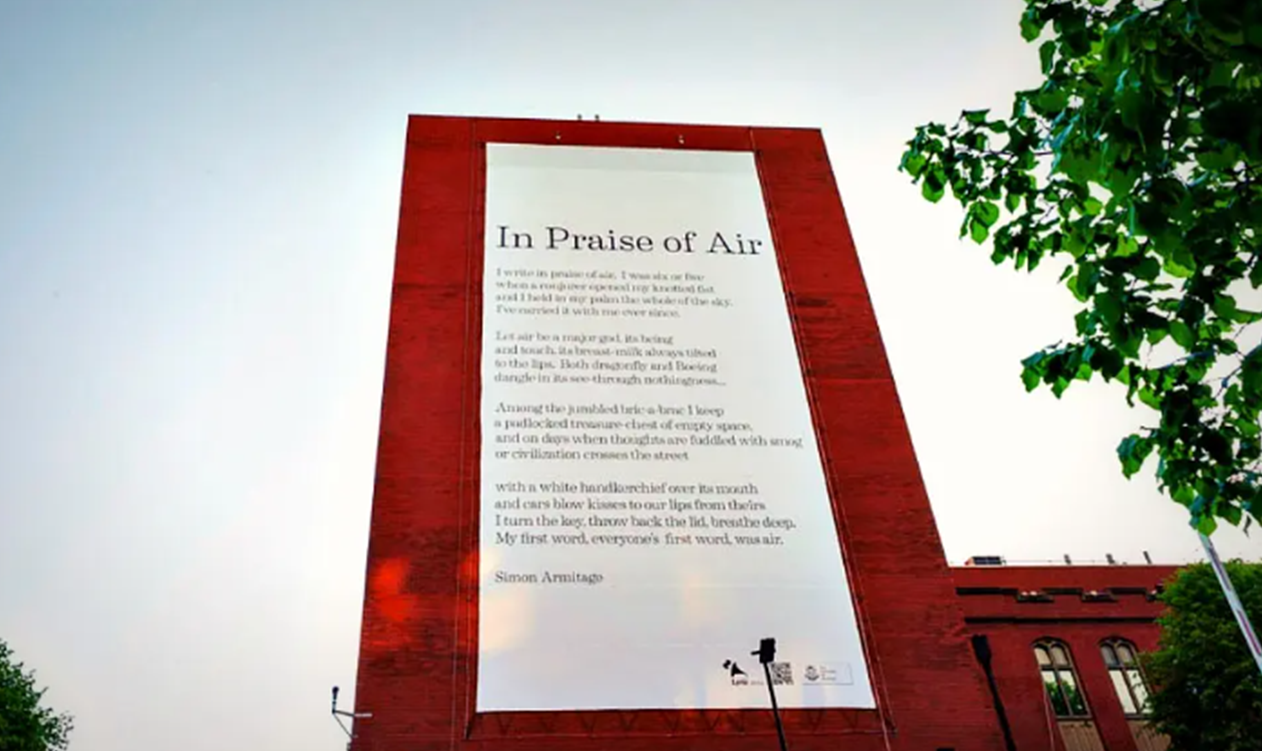
The campaign is built around the poem "In Praise of Air" by Simon Armitage. This poem was chosen for its creative approach to fighting air pollution. A key innovative element of this campaign involved researchers at the university devising an air-cleaning formula used in the material the poem was printed on, designed to eliminate the equivalent of 20 cars' NOx pollution daily. This 10m x 20m piece of material was coated with microscopic titanium dioxide particles that use sunlight and oxygen to purify the air by reacting with nitrogen oxide pollutants. The poem was displayed on the side of the university's animal and plant sciences building for a year, with hopes for wider use in roadside billboards.

User Personas

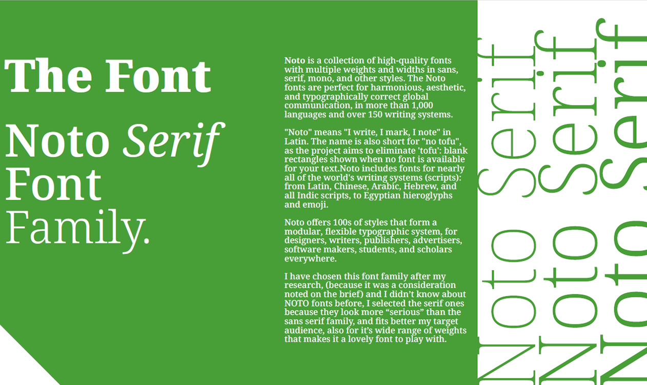
Typographic Strategy: Noto Serif

The font chosen for the campaign is the Noto Serif Font Family. Noto is a collection of high-quality fonts with multiple weights and widths, designed for harmonious, aesthetic, and typographically correct global communication in over 1,000 languages and 150 writing systems. "Noto" (from Latin: "I write, I mark, I note") is also short for "no tofu," aiming to eliminate blank rectangles when fonts are unavailable. Noto Serif was selected for its "serious" appearance, which better fits the target audience, and its wide range of weights, offering flexibility in design.

Campaign Messaging: "Reclaiming Breath"

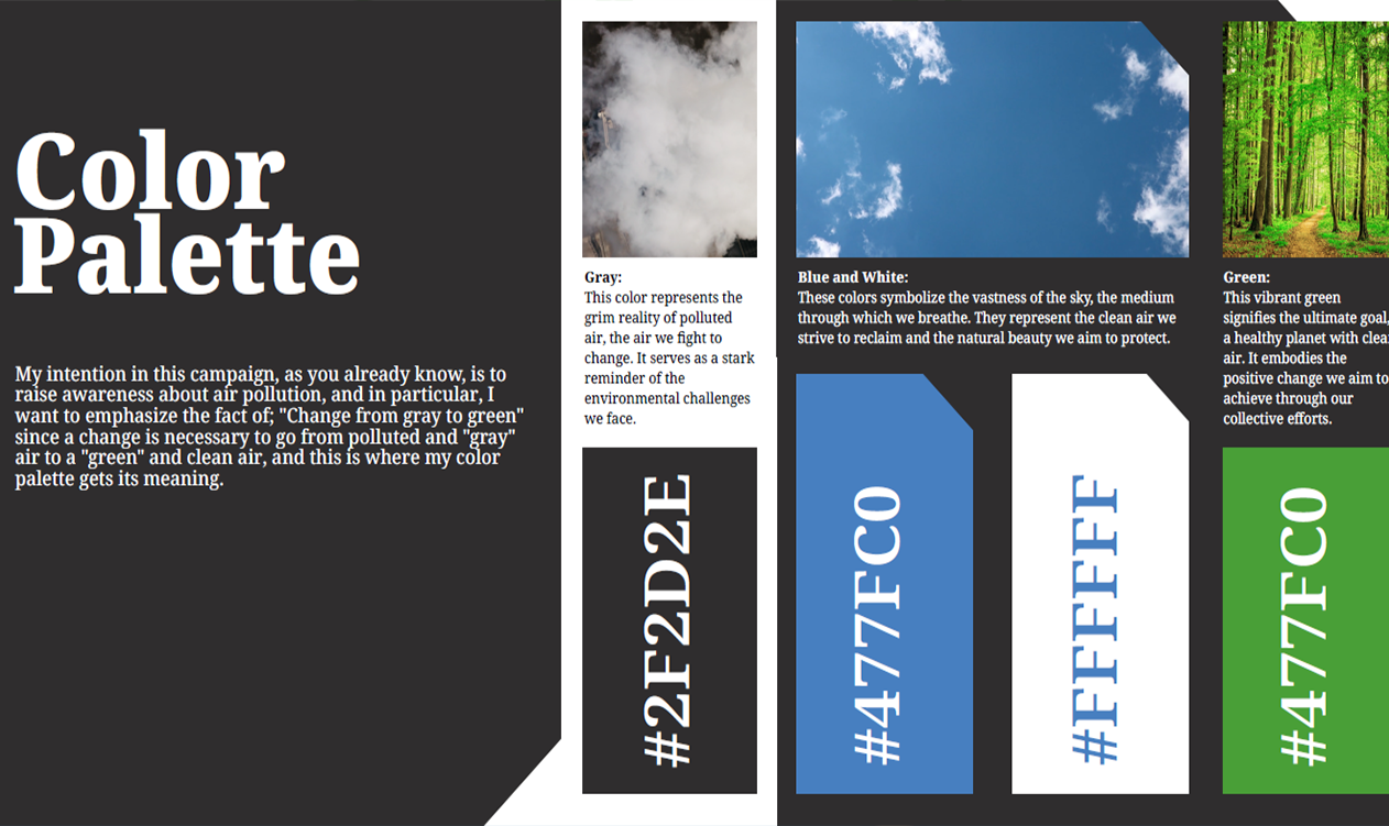
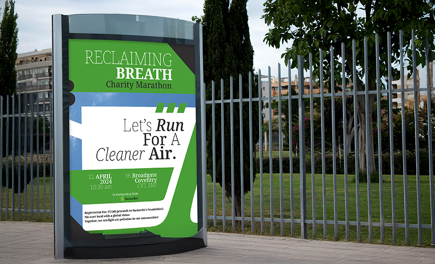
The core tagline for the campaign is "Reclaiming Breath." This tagline resonates on multiple levels: it empowers the community by implying ownership and agency over clean air as a basic right; it connects breath directly to health, serving as a constant reminder of the critical need for clean air; and it symbolizes collective action, uniting the community in the fight against air pollution. This concise and memorable rallying cry aims to empower people, inspire collective action, and ultimately help reclaim the right to clean air. A secondary message is "From Gray To Green," symbolizing the transformation from polluted to clean air.

Target Audience & Tone of Voice

The campaign targets active adults aged 18 to 65, who are passionate about outdoor activities, health-conscious, and vocal about environmental issues. Their primary information sources are social media and local news. The campaign aims to connect with them by tailoring messages to their interests and highlighting health benefits. The tone of voice is Formal & Optimistic, acknowledging the seriousness of Coventry's air quality issues while fostering hope and empowerment. This professional approach focuses on accurate facts, inspiring positive impact, and motivating participation. The campaign partners with Barnardo's Children's Charity Coventry, linking clean air to a healthy childhood.

Designing The Solution

Campaign Elements & Touchpoints

The campaign centers on three interconnected touchpoints designed to promote clean air awareness through creative, emotional, and participatory channels.

- Physical touchpoint: It featured an animated billboard using kinetic typography, handcrafted visuals, and layered video imagery to contrast nature with pollution-creating a striking call to action.

- Digital touchpoint: Two Instagram stories engaged audiences with dynamic text and relatable messages: one focused on collective impact through everyday choices, the other invited personal reflection with the prompt "What does clean air mean for you?" and the hashtag #ReclaimingBreath.

- Non-traditional touchpoint: Was a charity marathon with Barnardo’s, merging physical effort with advocacy. Participants supported the cause through their £5 entry fee, reinforcing the connection between childhood well-being and cleaner air.

Color Palette

My intention in this campaign is to raise awareness about air pollution by emphasizing a transformation: "Change from gray to green". This is where the color palette gains its meaning. The palette visually represents the journey from pollution to clean air: Gray: #2F2D2E This color embodies the grim reality of polluted air, serving as a stark reminder of the environmental challenges we aim to overcome. Blue: #477FC0 Symbolizes the vastness of the sky and represents the clean air we strive to reclaim, along with the natural beauty we seek to protect. White: #FFFFFF Also symbolizes the vastness of the sky and clean air, reinforcing the theme of natural purity. Green This vibrant green signifies the ultimate goal: a healthy planet with clean air. It embodies the positive change sought through our collective efforts.

User Personas

Conclusion

This campaign goes beyond merely raising awareness. It aims to empower people, inspire collective action, and ultimately help reclaim the right to clean air, a fundamental right for everyone. The combination of poetic depth, innovative anti-pollution technology, impactful typography, and diverse touchpoints (physical, digital, non-traditional) creates a compelling and memorable message. The "Reclaiming Breath" campaign is a rallying cry designed to resonate with those who care about their health and the health of our planet, fostering local action with a global vision.