The Piece was developed as an editorial design project focused on marrying graffiti’s raw visual energy with structured education. Through deep research into graffiti’s techniques and cultural roots, the project aims to broaden awareness and appreciation for street art by turning its vibrant expression into an interactive coloring experience. The book bridges gaps between generations and artistic skill levels, introducing elements like tagging, throw-ups, and pieces alongside historical notes and cultural references.
The Piece
A culturally-rich graffiti art coloring book designed to engage users in creative expression while educating them on the techniques, history, and impact of urban art movements.
The project
The Challenge
A primary challenge was accurately translating the dynamic and rebellious nature of graffiti into a format that’s approachable and informative without losing authenticity. Achieving a layout that balances educational content with creative freedom required iterative experimentation.
Research & Planning
Style & Audience Understanding
Extensive research explored the global impact of graffiti, its stylistic variations, and the pioneers of the movement. This informed illustration styles and content structure, ensuring accuracy in representation. The book is tailored for users aged 15-40 with varied artistic experience from casual colorists to urban art enthusiasts providing both relaxing engagement and artistic exploration.

Designing The Solution
Layout & Illustration Development
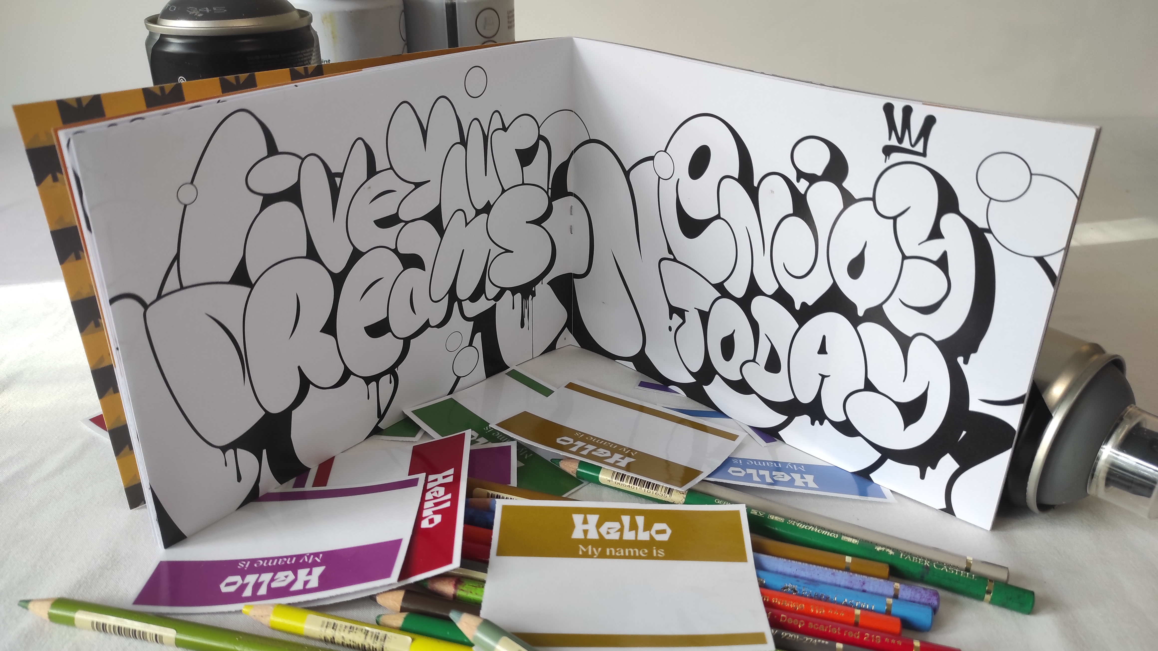
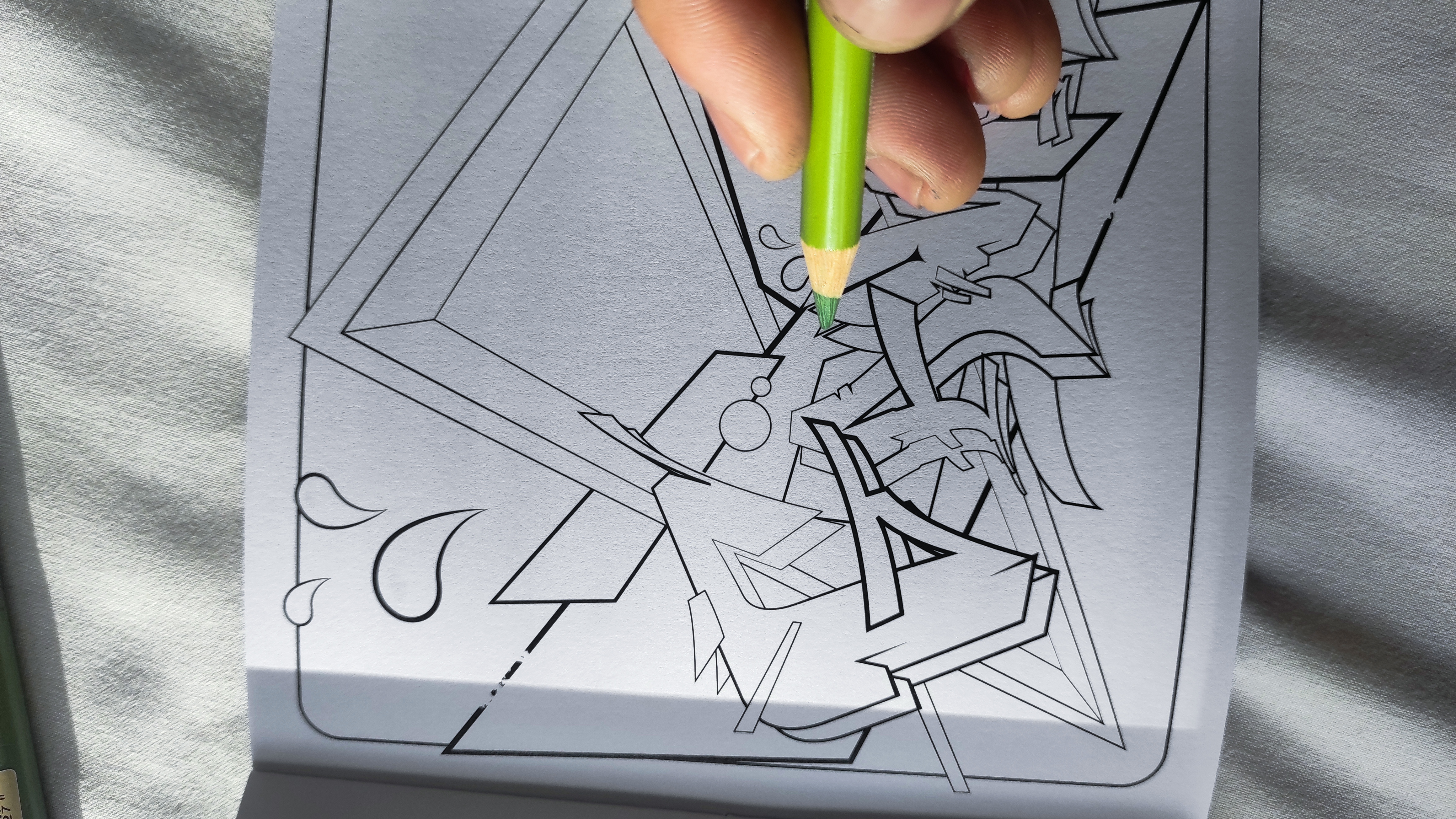
The layout was developed through trial and error-testing type hierarchies, spatial divisions, and flow. Grid structures supported balance, while illustration experimentation brought authenticity to the tags, throw-ups, and pieces. Cultural references helped root each drawing in its origin, honoring the voices and neighborhoods that shaped graffiti.


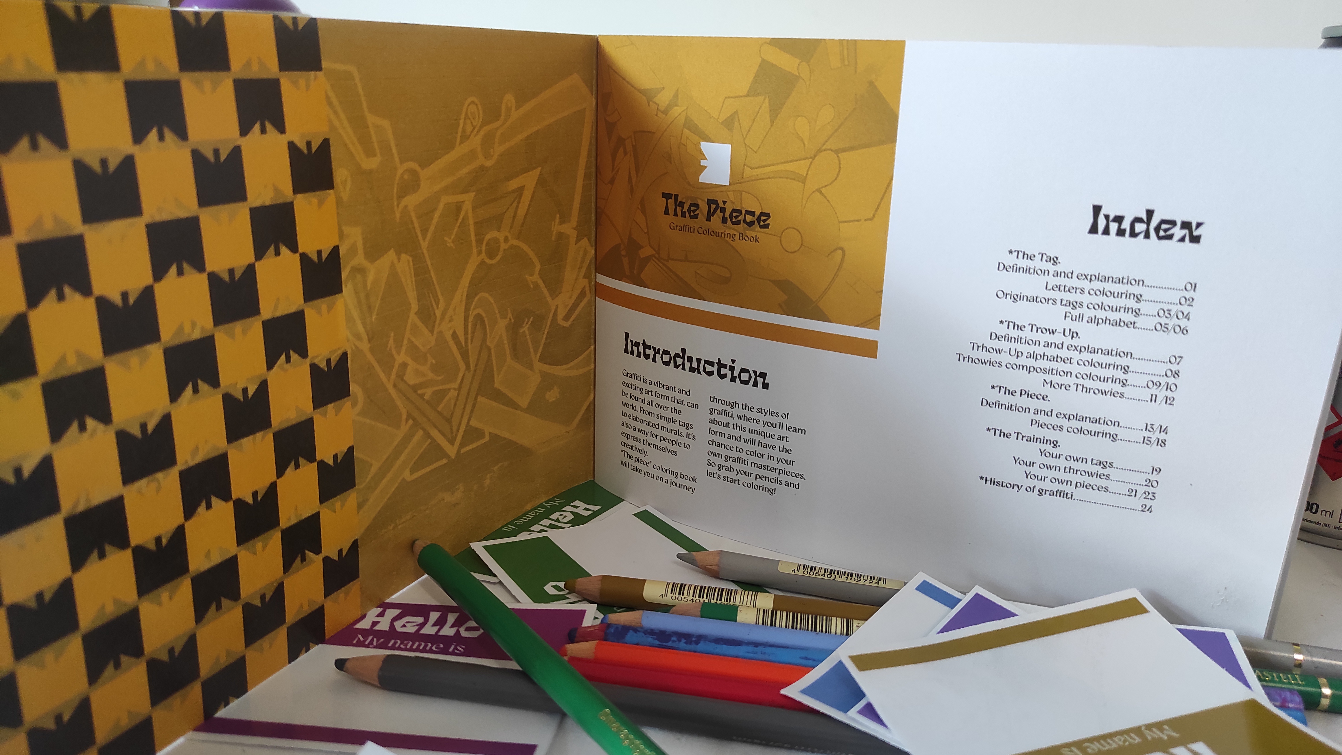
Format, Color & Typography
The choice of a cinematic A5 landscape format breaks from tradition to reflect the dramatic canvas of street walls. A bold visual identity was created using black, medium yellow, and brown, a palette that evokes urban warmth while maintaining visual clarity. Typography supports clarity and mood, while a grid structure enhances navigation.
The fonts I’ve chosen are two variable fonts that balance boldness with warmth. Dilemma Variable brings expressive energy with its wide, irregular strokes-ideal for graffiti-style titles and standout visuals. Gyst Variable, on the other hand, offers a soft, friendly tone with rounded forms, making it perfect for approachable body text. Together, they create a dynamic yet inviting typographic voice that matches the playful spirit of the project.


Packaging & User Engagement
Packaging was designed to evoke a premium yet playful street vibe. Key elements included:
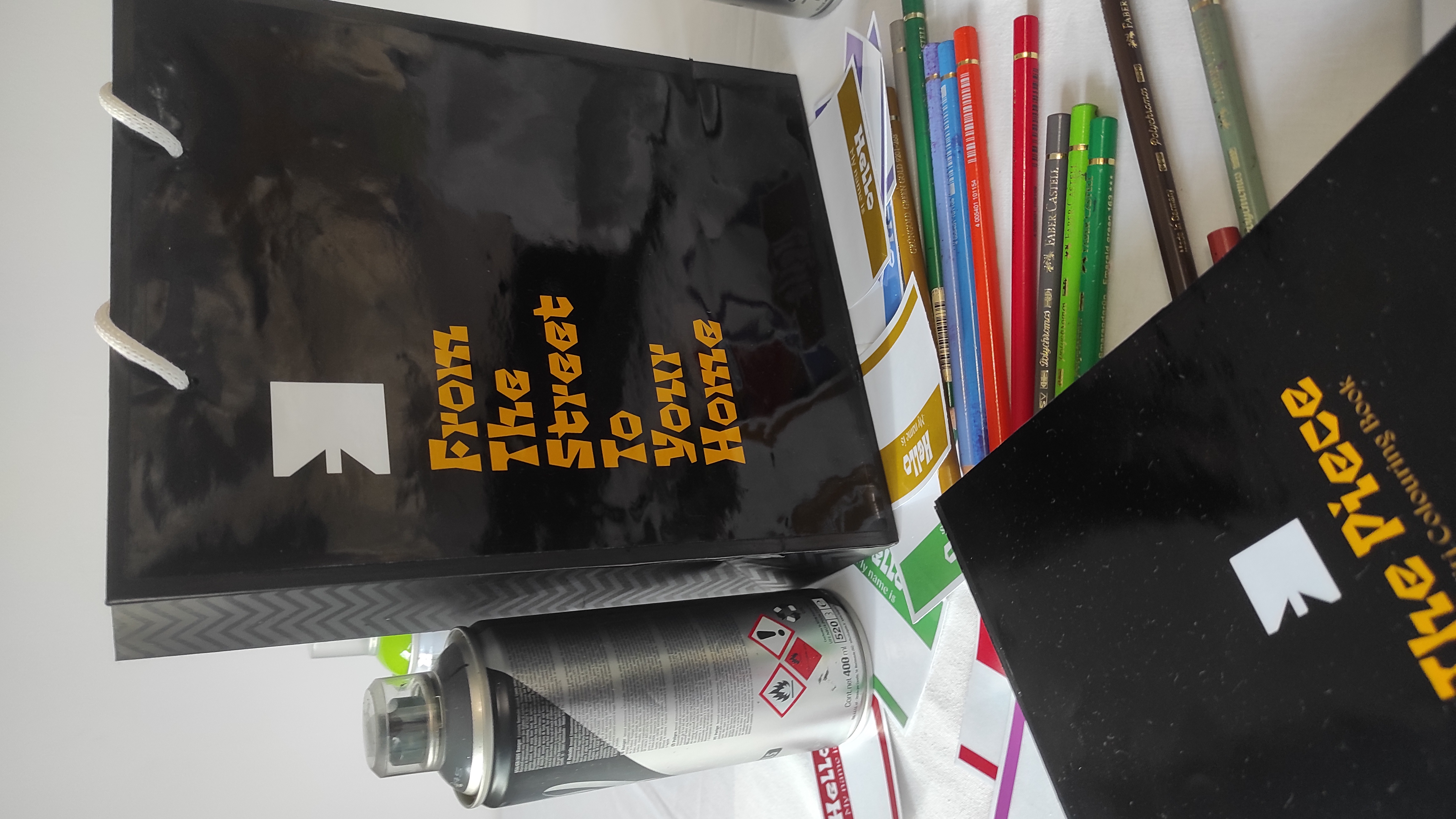
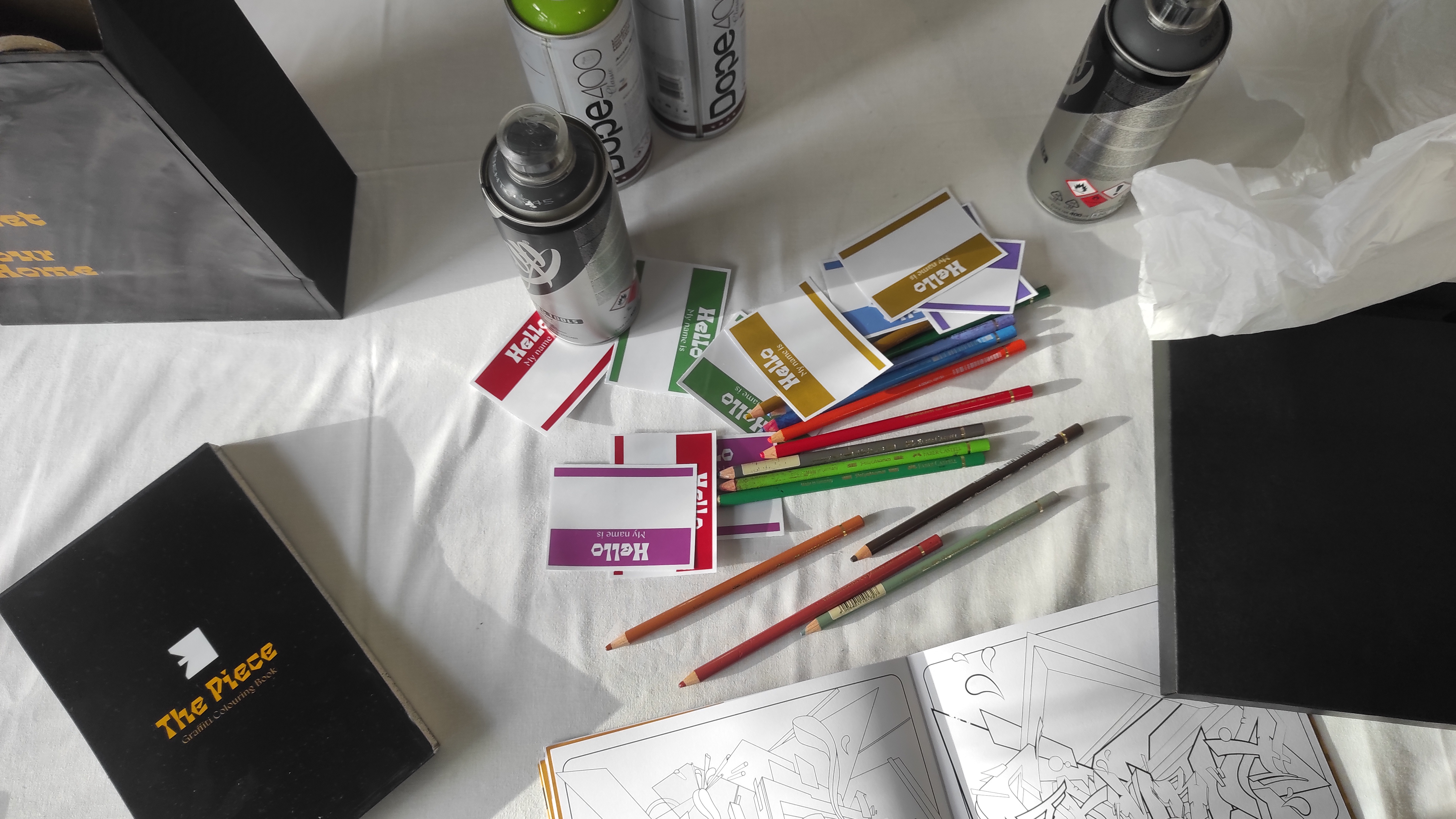
- Glossy Black Shopping Bag: Featuring the message “From the Street to Your Home”.
- A5 Box with Band Cover: Stylish and reusable for display or storage.
- “Hello My Name Is” Stickers: A nod to graffiti’s tagging roots and a gift for users.
- Yellow Hanging Tags: Create anticipation and highlight brand identity.
- Soft Wrap Paper: Elevates the unboxing experience.


Conclusion
The Piece is more than a coloring book, it’s a curated experience meant to educate, engage, and inspire through the lens of graffiti. By combining thoughtful editorial design with creative user interaction, the project transforms urban art into an accessible medium of personal exploration and cultural appreciation. The strategic use of format, color, typography, and packaging underlines the message: Graffiti isn’t just rebellious, it’s educational, expressive, and deeply human.